

Have you ever wondered why some colours differ from their original shade after a while? This article explains lightfastness, a very important property of artist paints.
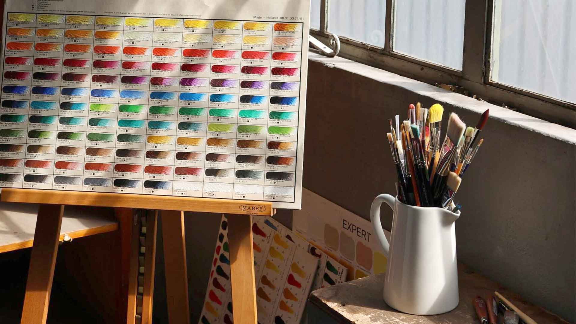
Every tube of paint carries technical information about the colour inside. Among transparency ratings and pigment codes, you’ll find a lightfastness rating, a measure of how that particular pigment behaves when exposed to light over time. Lightfastness has nothing to do with paint quality. It’s a natural characteristic of the pigment itself, like transparency or opacity. Some pigments remain stable for centuries. Others change more quickly. Understanding these differences helps you choose the right materials for each creation.
How Lightfastness Works
Light carries energy. When it strikes a painted surface, ultraviolet wavelengths can break down the molecular structure of certain pigments. This causes colour change, sometimes subtle, sometimes more pronounced.
The speed and degree of this change depends on the pigment’s chemical composition. For example, earth pigments from iron oxides are exceptionally stable. They come from minerals that have survived geological time unchanged. Some organic pigments, composed of carbon compounds, have molecular structures more vulnerable to UV energy.
This isn’t a flaw. It’s simply their chemistry.
How to Read Lightfastness Ratings
Manufacturers test pigments under controlled light exposure and report results using standardised systems. The most common are ASTM and Blue Wool Scale, though some manufacturers use their own notation.
ASTM System (American Society for Testing and Materials)
I: Excellent lightfastness
II: Very good lightfastness
III: Not recommended for professional use
Blue Wool Scale
8-7: High lightfastness
6-5: Moderate lightfastness
4-1: Lower lightfastness
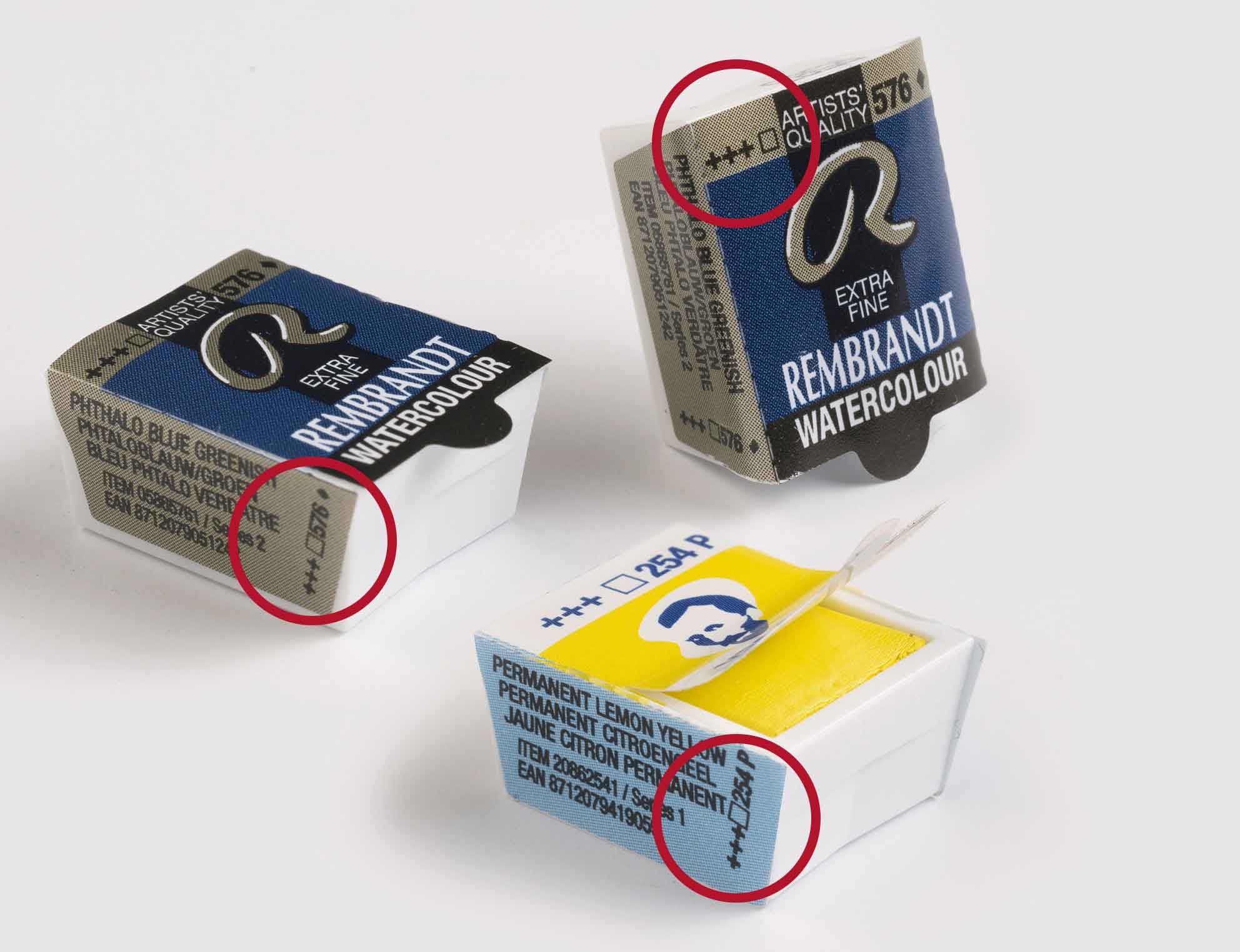
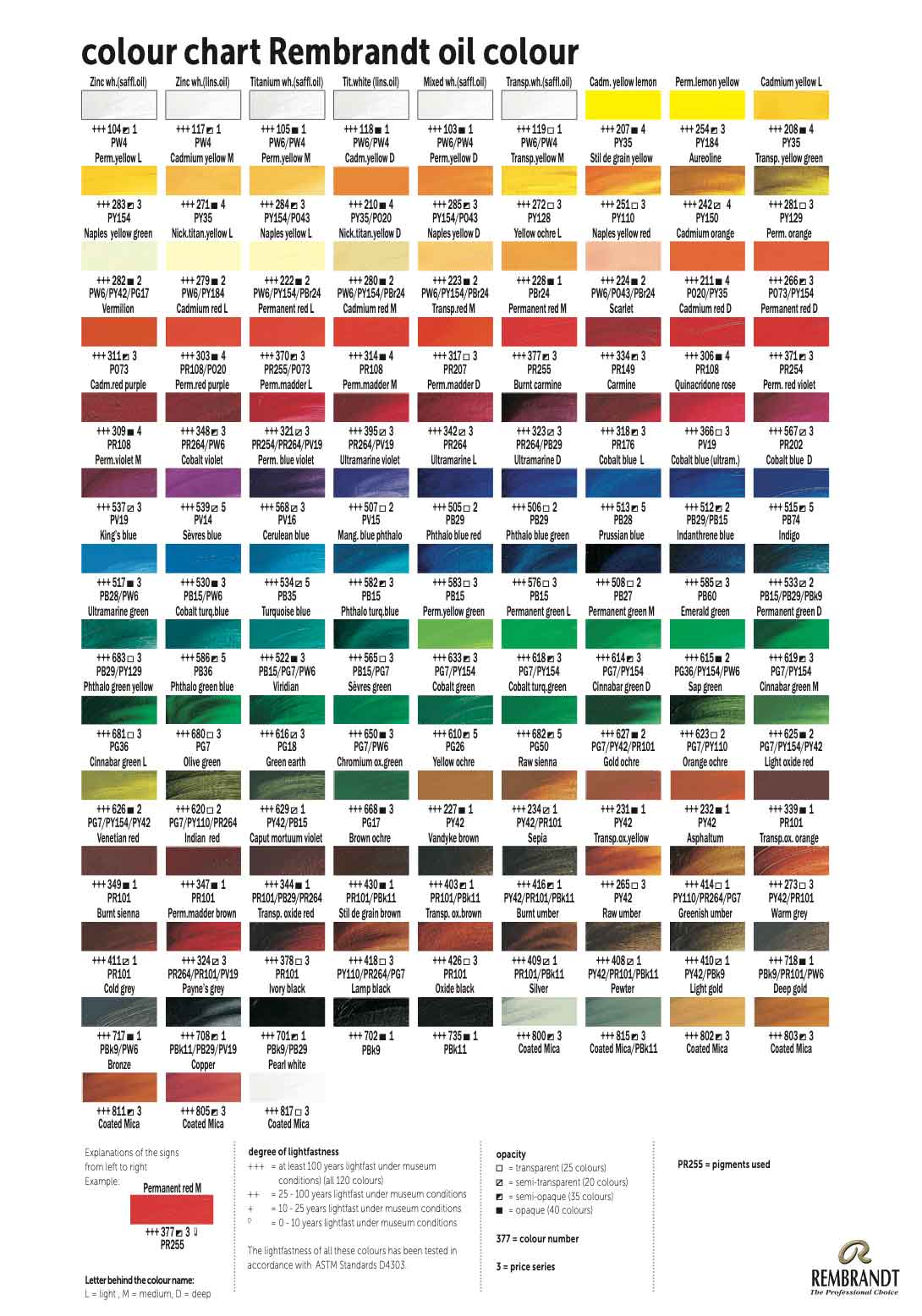
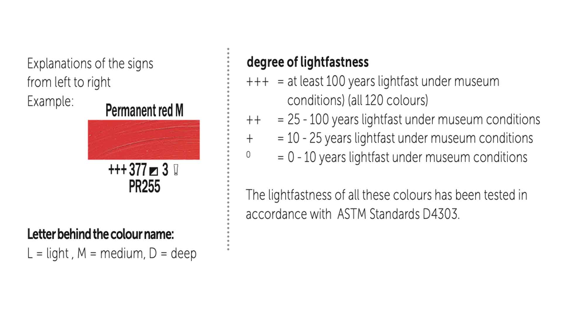
Royal Talens System (used on brands like Rembrandt and Van Gogh)
+++: At least 100 years under museum conditions
++: 25-100 years under museum conditions
+: 10-25 years under museum conditions
º: 0-10 years under museum conditions
Museum conditions mean controlled temperature, limited light exposure, and protection from environmental factors. Your artwork experiences different conditions, but these ratings provide relative comparison.
Pigment Chemistry Matters
Inorganic pigments come from minerals such as iron oxides, cadmium compounds, cobalt, chromium, and titanium. Their molecular structures tend to be exceptionally stable when exposed to light.
Examples include:
- Earth colours (ochre, burnt sienna, raw umber)
- Cadmium yellows, oranges, and reds
- Blue ultramarine
- Cobalt blue and violet
- Chromium oxide green
- Titanium white
Organic pigments are made from carbon-based molecules. Modern synthetic organic pigments include quinacridones, phthalocyanines, and perylenes. While many perform excellently, some have molecular structures more sensitive to UV energy.
The distinction isn’t “good versus bad paint.” Organic pigments often deliver vibrant, intense colours with transparency that inorganic pigments cannot match. They serve different purposes.
How Medium Affects Performance
The same pigment performs differently depending on its binder. Oil encapsulates pigment particles in oil, providing some UV protection. The thick film acts as a shield. Watercolour disperses pigment in gum arabic, a thinner, more transparent medium. Pigment particles sit closer to the surface, more exposed to light. This makes watercolour particularly dependent on lightfast pigments for permanent work. Acrylic encases pigment in polymer emulsion (acrylic binder), offering good protection similar to oils. For work intended to last, watercolour demands the most attention to lightfastness ratings.
The Dilution Factor
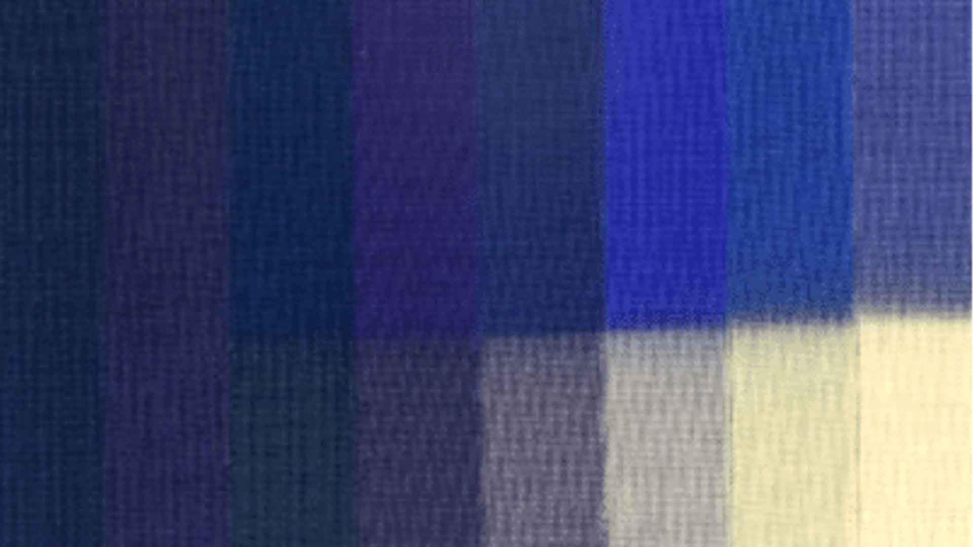
There’s something most painters discover: pigments behave differently at full strength compared to tints and dilutions. When you mix paint with white or dilute it heavily, you spread pigment particles farther apart. Light penetrates more easily between them, accelerating potential change. A pigment with high lightfastness at full strength (without dilution or mixing) may perform differently in a lighter tint. This particularly affects watercolour washes and oil paintings mixed with white. Manufacturers test both full-strength and tinted applications for exactly this reason.
When Lightfastness Matters Most
- For work you’re selling: Buyers expect artwork to remain stable. Professional integrity requires permanent materials.
- For exhibition pieces: Gallery lighting and exhibition conditions accelerate exposure.
- For outdoor display: Direct sunlight dramatically intensifies UV exposure.
- For personal work: If the piece matters to you long-term, choose stable pigments or storage conditions that protect it from UV radiation.
When It Matters Less
- Practice and studies: Developing skills doesn’t require archival materials. Use what serves your learning.
- Work for reproduction: If you’re scanning artwork for prints or digital use, the original’s longevity matters less.
- Sketchbooks and sketches: Personal sketchbooks stored away from light experience minimal UV exposure.
- Experimental work: Exploring technique and colour mixing doesn’t require permanent materials.
The key is matching materials to intent.
Protecting Finished Work
Beyond choosing lightfast pigments, you can protect artwork through placement and framing. UV-protective glass filters harmful wavelengths while maintaining visibility. Essential for watercolours, pastels, and works on paper. A good UV varnish adds a protective layer to oils and acrylics (though it cannot fully prevent lightfast pigments from eventually changing).
Placement matters enormously. Work hung opposite a window experiences far less UV exposure than work in direct sunlight. Indoor lighting still contains UV wavelengths, just less intensely than daylight. Even indoor artwork benefits from lightfast pigments.
Finding Lightfastness Information
Check three places:
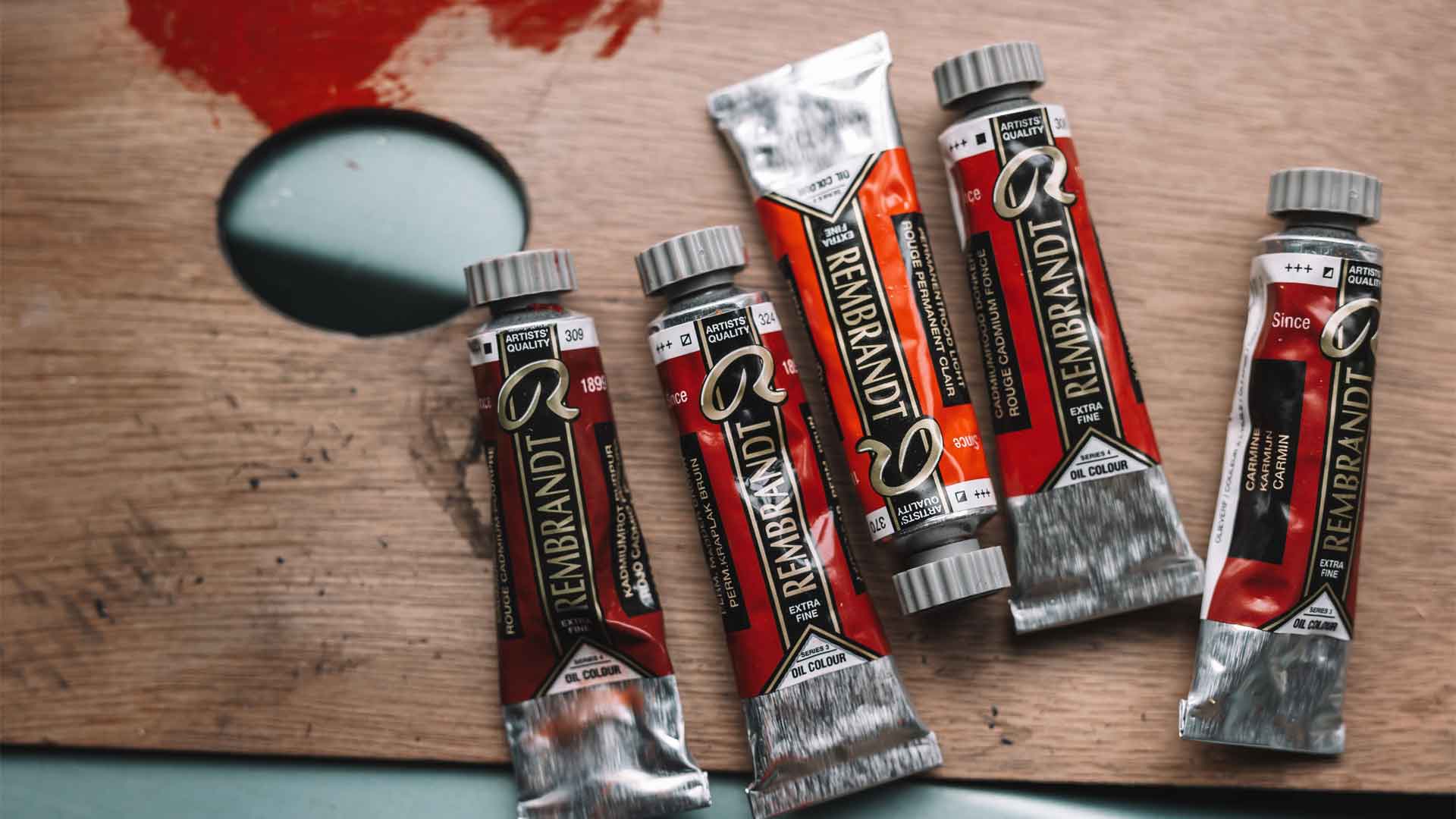
– On the tube: Most professional paints print the rating directly on the label next to the colour name.
– In manufacturer catalogues: Colour charts list technical specifications for each shade.
– On company websites: Detailed pigment information appears in product specifications.
At Art & Colour, we stock brands that provide lightfastness information. Royal Talens clearly indicates lighfastness in brands like Rembrandt and Van Gogh with the +++ system.
Creating with Knowledge
Lightfastness ratings provide information, not warnings about problematic colours. They tell you how a pigment behaves so you can make choices based on your needs. Some of the most beautiful colours in art history weren’t particularly lightfast, artists used them nonetheless, understanding their limitations. Renoir knew his rose madder would fade. He chose the beauty of the moment over permanence. You can make the same choice, armed with the same knowledge.
The difference now is that we have stable alternatives for almost every colour. Quinacridone reds replace fugitive alizarin crimson. Phthalocyanine blues offer permanent vibrancy. Modern chemistry gives us options.
Read the lightfastness indications. Learn with what you are working with. Create with depth and knowledge.